Markup Conventions for jQuery Foundation Sites
All of the sites that are part of the jQuery WordPress network use the following markup conventions to apply styling to elements. Please adhere to these conventions if you are working on any of our web sites. This page is a live example of these conventions in action.
Tools & Libraries
The jQuery sites are built with a number of existing libraries and tools. The list below will attempt to catalog the most important ones:
Background & Logos
The background colors and logos are set in the base.css file of the parent theme and are triggered by classes on the body.
Unless you're setting up a site with a new color scheme and logo, you should just need to use one of the following classes.
- jQuery:
body.jquery(blue) - jQuery UI:
body.jquery-ui(orange) - jQuery Mobile:
body.jquery-mobile(green) - jQuery Foundation:
body.jquery-foundation(navy) - Sizzle JS:
body.sizzlejs(red) - Qunit JS:
body.qunitjs(purple)
If you are adding a site with a new logo/color scheme, please add to base.css. Don't forget the retina version of the logo and the media query to toggle it based on pixel density.
Other colors (like headers, buttons & links) and layout styles specific to the site will be in the style.css of that site's theme.
Please see the Colors section of the jQuery Brand Guidelines for more information about our color story.
Typography
The jQuery sites use 4 typefaces. Please see the Typography section of the jQuery Brand Guidelines for more information about our font choices.
Cairo
Use Cairo for headings.
Also for navigation, buttons & actions.
|
1
|
|
Helvetica Neue
Used Helvetica Neue for body copy.
|
1
|
|
Source Code Pro
Used Source Code Pro for code blocks.
|
1
|
|
Foundation
Please use this basic foundation for all pages:
- The
#containersets the background color and provides padding around the white content area. - The
#content-wrappercreates the white content area and gives the appropriate padding. - The
#contentshould be used for the main content column. - The
#sidebarshould be used for the secondary column or sidebar.
|
1
2
3
4
5
6
7
8
9
10
11
12
13
14
15
16
17
18
19
20
|
|
Layout Options
You can easily customize different layouts for #content.


body.content-full

body.content-right

body.content-full.full-width
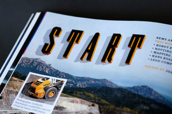
Images
Images can be floated and given captions very easily.
Image Full
 Have you ever seen an orange up close? It's really bumpy and shiny. Kind of like a martian landscape. Oranges are really hard to get open, too. And if you do manage to peel the skin off, your fingers will smell like oranges for at least 3 hours. Oh, those oranges. They are grand.
|
1
|
|
Image Floated Left
Have you ever seen an orange up close? It's really bumpy and shiny. Kind of like a martian landscape. Oranges are really hard to get open, too. And if you do manage to peel the skin off, your fingers will smell like oranges for at least 3 hours. Oh, those oranges. They are grand.
|
1
|
|
Image Floated Right
Have you ever seen an orange up close? It's really bumpy and shiny. Kind of like a martian landscape. Oranges are really hard to get open, too. And if you do manage to peel the skin off, your fingers will smell like oranges for at least 3 hours. Oh, those oranges. They are grand.
|
1
|
|
Image with Caption
|
1
2
3
4
|
|
Image with Caption & No Border
|
1
2
3
4
|
|
Embeds
For an embedded element like a YouTube or Vimeo video, iframe, etc. make sure you wrap the element in an embed div so that it scales proportionately with media queries.
Video Embed
|
1
2
3
|
|
Buttons
Styling buttons is as simple as adding a class of button. Other options include dark and large.
Button Styles
Regular ButtonDark Button
Large Button
|
1
2
3
|
|
Form Buttons
|
1
2
3
|
|
Default Element Styling
Headings
Heading One Looks Like This
Heading Two Looks Like This
Heading Three Looks Like This
Heading Four Looks Like This
|
1
2
3
4
|
|
Lists
- Unordered List
- Looks Like
- This
- Ordered List
- Looks Like
- This
|
1
2
3
4
5
6
7
8
9
10
11
|
|
Basic Elements
Have you ever seen an orange up close? It's really bumpy and shiny. Kind of like a martian landscape.
Oranges are really hard to get open, too. And if you do manage to peel the skin off, your fingers will smell like oranges for at least 3 hours. Oh, those oranges. They are grand.
|
1
2
3
4
5
|
|
Code Blocks
|
1
2
|
|
|
1
2
3
4
|
|
Blockquotes
Go do something awesome today. You'll be glad you did.
|
1
2
3
|
|
Header Block .block
Header One Block
This gives your header a background and padding. Great for column headings.
Header Two Block
|
1
2
3
|
|
Centered Text - .center-txt
Header One Centered
This is a paragraph that has been centered. It's great, huh? Use this class to center any text.
|
1
2
|
|
Banners
Secondary Banner
|
1
2
3
|
|
Secondary Banner Large
|
1
2
3
4
|
|
Forms
Forms
Top aligned labels
|
1
2
3
4
5
6
7
8
9
10
11
12
13
14
15
16
17
18
19
20
21
22
23
24
25
26
|
|
Grid
We are using the Zurb Foundation grid as a basis for the grid. Please only use this grid inside of the main foundation mentioned above (i.e. in the #content or #sidebar).
We'll have a reference eventually, but for now go here to see how to use the grid.